The Problem with Licensed Products

Monopoly may be the most iconic board game out there. Its minimal design compliments the dry complexities of balancing mortgages, taxes and lengthy play.
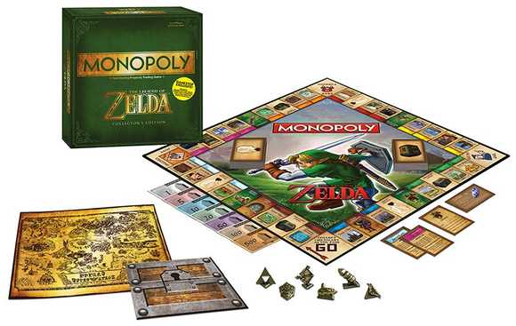
That careful consideration is apparently thrown out the window with licensed versions, most recently MONOPOLY: The Legend of Zelda Edition.
The centerpiece Link on this board game mash-up is the worst eyesore. It’s a tiring distraction that takes me away from the other details. I would have much preferred a subdued Triforce behind a centered Monopoly logo, or just a lone gold and green Monopoly logo. Even the symbol collage on the cover of Hyrule Historia holds a fairly robust LoZ history. Why not pop that in the center of the board.
Aside from the obnoxious centerpiece, the box uses the same cartoon green from Hyrule Historia, a book I’ve walked away from purchasing number of times based on the shade of green alone.
It’s a sad state of affairs when officially-licensed video game products that don’t look like officially-licensed video game products are few and far between. Maybe this is why fan art is so prevalent and highly-regarded. (Hint, hint)
If you’re going to build physical items from virtual worlds (especially cartoony ones), tailor them to the aesthetics that work in the real world. Make them fit. We do not live in Hyrule nor The Mushroom Kingdom. It’s likely no mistake that Mickey’s Toontown rests at the rear of the Disneyland. It is of pure novelty while the rest of the park feels inhabitable.
