In Rainbows
After publishing ‘Building Zero Counts’, I became curious about syntax highlighting — the walls of rainbowed text you see splayed out in front of developers.
In ‘Building Zero Counts’, I used a gradient from sea foam green (#00fa92) to Zero Counts blue (#004992) to denote code. Here’s the Bitbucket Pipeline YAML example I used:
image: php:7.0.27

pipelines:
 default:
 - step:
 script:
 - apt-get update
 - apt-get -qq install git-ftp
 - git ftp push --user $SFTP_username --passwd $SFTP_password --verbose sftp://ftp.[host]/home/[username]/[domain]/wp-content/plugins/jetpack/modules/minileven/theme/pub/minileven
 custom: # Pipelines triggered manually
 full-deploy-after-jetpack-update:
 - step:
 script:
 - apt-get update
 - apt-get -qq install git-ftp
 - git ftp init --user $SFTP_username --passwd $SFTP_password --verbose sftp://ftp.[host]/home/[username]/[domain]/wp-content/plugins/jetpack/modules/minileven/theme/pub/minileven
The color scheme and implementation is completely useless, but it’s meant to abstract how I perceive syntax highlighting. In the tech industry, it’s impossible not to see engineers, developers, and designers living in front of colorful walls of text. And for me, it’s impossible not to want to live and work in this world of rainbows. So, the way I display code on Zero Counts is a window into the beauty I see, the envy I have, and my ignorance of what is actually going on with syntax highlighting.
Poking around, I found some interesting posts about syntax highlighting and some methodologies behind color schemes and implementation. Ethan Schoonover’s Solarized is a simple color scheme that shares the same syntax highlighting between light and dark themes. It’s inspired by reading in the shade vs direct sunlight and incorporates fixed color wheel relationships:
Solarized works as a sixteen color palette for compatibility with common terminal based applications / emulators. In addition, it has been carefully designed to scale down to a variety of five color palettes (four base monotones plus one accent color) for use in design work such as web design. In every case it retains a strong personality but doesn’t overwhelm.
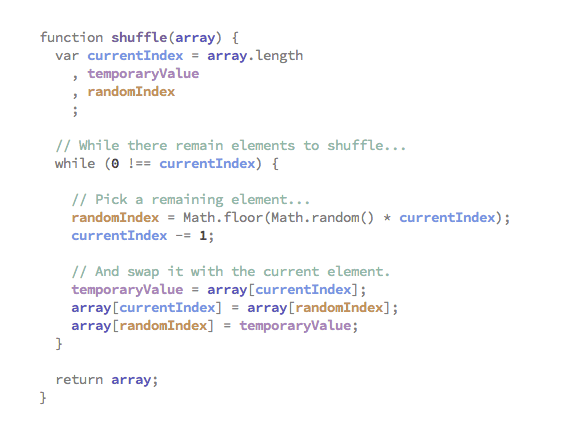
Meanwhile, Evan Brooks notes switching to semantic highlighting from syntax highlighting — an inverted use of highlighting, moving away from colorizing built-in keywords such as let, var, and function to coloring user-defined variables, methods, etc.:
We think syntax highlighting makes the structure of code easier to understand. But as it stands, we highlight the obvious (like the word function) and leave most of the content in black. Rather than highlighting the differences between currentIndex and the keyword function, we could highlight the difference between currentIndex and randomIndex. Here’s what that might look like:

Brooks’ method has been incorporated in a variety of text editors. Beyond that, KDevelop had actually incorporated semantic highlighting in 2009 — five years before Brooks’ post:
Understand code: The real facility that helps you understanding global code-structure is the navigation-tooltip or the code-browser. However those are not very useful to understand local algorithms. The following picture illustrates my favorite part of the semantic highlighting: Local Variable Colorization. That colorization assigns a semi-unique color to each variable in a local context. This allows much easier distinguishing those variables, largely without reading their full name at all. By freeing you of actually having to read all the variable names, this allows grokking local code relations faster, and has already helped me fixing quite a few very stupid bugs right away. 🙂
Great minds!
Syntax highlighting is a silly reason to want to learn to code, but well designed colorization and implementation certainly make it an attractive work environment. Who wouldn’t want to live in rainbows?
